MECO Show and Sale

MECO Show and Sale
2016 Show & Sale will be the Saturday 14th May 2016 held at the Peachland Community Centre in Peachland BC. contact person Barb Janes-Yeo at 250-757-2842 barbandpaulyeo@shaw.ca

Sunday, 30 December 2012

No Virginia, Rich Little wasn't the father of Impressionism...

A Claudia Hansen Post Impressionism piece "Summer"
May the Goddess help me, I am an Impressionist. Well, maybe modern Post-Impressionist, anyway. I start out with good intentions of making something "photo realistic", but then the right brain viciously elbows the  left brain right in the nose and takes over the show, all while poor left brain whimpers in a corner, waiting for the blood to stop. 

The right brain took over right there, did you notice? 

Occasionally I get an overwhelming urge to paint. This summer I even did a little "en plein air", loading my packsack with paints and such, and headed out to a nice little beach where I painted the morning away. I was finally chased off by an impending storm, but what a rush. I was told later that "en plein air" is "hard". Good thing nobody told me that first. Okay, granted, you deal with weather, stuff falling in your paints, small children using the bush you are currently painting as an impromptu washroom, etc., but nothing can compare with the feeling, and what inspiration can be had sitting outside, soaking up the day and the wonders (outside of the red faced parent rushing little Billy and his nervous bladder off out of your  line of sight, of course).

I felt like doing a little painting  (did you see what I did there? No? Well, you will ) this weekend. Unfortunately, I am not prepared to sit outside today as it is December out there, and when your paints freeze it makes it a bit difficult to be creative.

My journey started with a canvas. This past summer I happened across some very nice little prepared canvases, just the right size, that I bought from a large box store specializing in crafts, and dreamed and plotted what I was going to do with the sweet find. Admittedly, I have no idea what I have done with them since, so I fell back on  my extensive grade 10 art  class training  (translation - we spent a whole hour on it) in "how to prepare a canvas". 

Stock Wood from Hobby Supply Store
Drawing out a pattern
Using my trusty geometry set and my Santa pencil (optional), I mapped out the outside lines of my canvas. The overall size will be 2 inches by 3 inches (5.1 cm x 7.6 cm approximate).

Frame lines and stock wood for frame
 I then drew the frame line by marking off one-quarter of an inch (0.64 cm) on all sides. This was the size of my frame stock wood. Handy tip - paint your stock before you cut it, and you won't then have to paint little fiddly bits of wood later on. 

Wood with painter's tape
 To keep my edges sharp, and to keep the area where I will be finally gluing my frame down, I have taped off the framing area. 

Gesso'd canvas
 Back in that  Grade 10 art class of which I spoke, we used Gesso to prepare the surface of the canvas . It makes for a nice smooth and sealed painting surface, and it can be sanded down as well. I coated my canvas with two thin coats of Gesso, letting it dry in between coats. One word of warning - depending on how thin the wood is, the moisture could cause warpage. After the Gesso was dry to the touch, I put something heavy on top to flatten it so it could cure.

Sketchy-sketchy
Once the Gesso was cured enough, and the board was flat enough, I sketched out a general idea of what I wanted the picture to look like. Don't get too caught up in your drawing though - paintings do change (see right brain comment above) once the paint is being applied. 

Adding the Sky
 With a sky, you want to go from a darker blue, to a lighter blue, with the lightest around the mountains. I used Cerulean blue, Ultramarine blue, and white (as recommended by the painting guide I used) , and brought down the sky with a wash. 

Adding the water
 I have started adding the water. I have been told that water - to get the right look of depth - starts out dark in the background, and fades to the lighter colours in front. It is a little harder to do a wash right in this scale, just as a caveat. You may have to water your colours down with water, or use a Gesso  to dilute and as a paint extender (so it isn't drying faster than you can paint the picture, and in small scales, that paint is going to dry aggravatingly too fast to get the blending effect you may want). It was also recommended not to put too much detail into the reflections, as it is a little jarring for the eye - once again, the great Scale Master and his roving band of Painting police are looking over our shoulders. 

Adding Mountains and background
 Successful painters use the power of 3 - background, mid ground, and foreground. You are always working from the "back" of the painting towards you. Shapes and colours are first, and details come in second, highlights and other finishing touches come in third. Don't get hung up on too much detail all at once. Having said that, as an Impressionist, you can break the rules and when anyone complains, you can say "um...Impressionist?"

Adding interest
I used artist's paints, which are geared more to this kind of painting. You can use craft paints, if you so desire and if your budget won't accept the cost of the good stuff, but I do like the quality of the artist's paints and they actually will last longer as they are sealed better. 

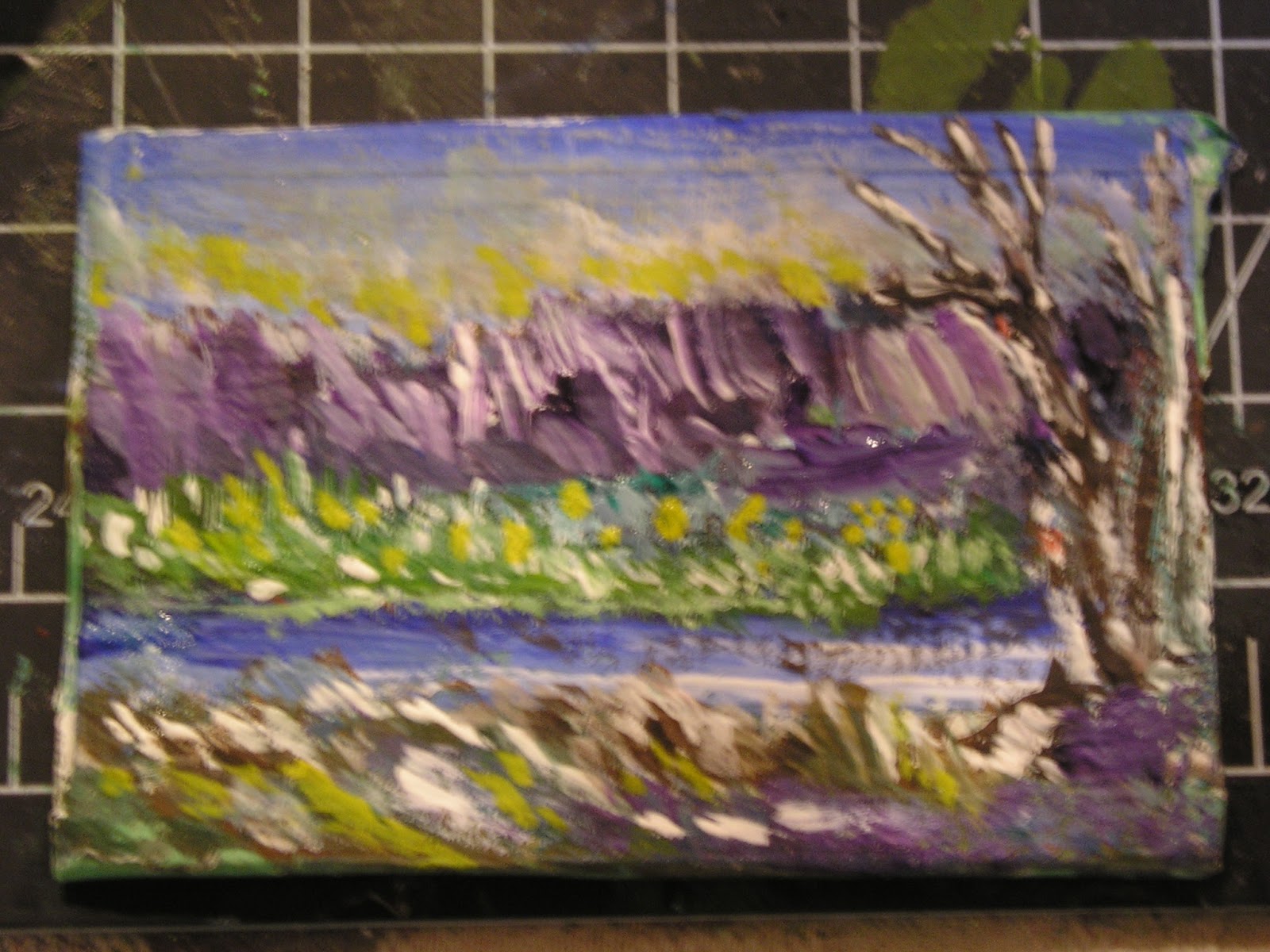
Having gotten to the point where I could rush headlong into the details, I started to play. One thing about painting is that you have to be strong enough to walk away before you go overboard - I think today  I didn't quite walk away in time. Still, no biggie. You don't learn if you don't try.

Painter's tape removed
 Once I was vaguely satisfied with my picture, I removed the painter's tape. Now you can see the nice crisp lines. You could stop here if you want (such as if you are making an artist's studio, and unframed work would be more true to such a scene) , with possibly adding a little matte gloss to protect the colours (acrylics are bad for fading, oils are better but oils can be a pain in the posterior with respect to drying times - it all boils down to personal preference and patience levels). The gloss will also enhance the colours, but again, your choice. 

A note on paint choice - acrylics tend to be a more forgiving medium, in that it is easy clean up, minimum fumes, and a little easier to work with. Oils take a long time to dry, but the blending opportunities are amazing. Water colours  are a difficult choice of medium to work with, but the effects can be worth the effort. In short, its up to you, bub, which one you want to play with. 

Cutting out my frame
 Frames are pretty easy, if you have the right tools. I am doing a little cheating here - I have cut my mitre on one side, lined it up on my painting, and will make a little tick mark at the corner where the paint ends. That tick is where my bottom mitre will happen.  Granted, I am breaking rules of carpentry here by not measuring and using math and other such voodoo, but with items so small you can get away with it

Mitre Tool and painting being framed
 I find these little mitre tools to be fabulous, as you get the control of a scissors and they cut balsa and basswood like a treat.  They have a cutting guide, and the 45 degree angle that you need for a mitred frame is already set up for you on the tool. Mitre boxes work, but you don't get the precision and control in small scales as you do with the tool. One tip, always be consistent where you cut - be it on the line, before the line, or after the line, because that *is* where you will realize that your frame is just a little too short, a little too long, or a little off square/rectangle when you put the whole thing together. Also, remember those three little magic words that make the world go round - i.e.  "dry fit first".

Framed!
 There you have it, a cute little framed painting. If you are not a painter, of course, you can do cheats by reducing any image, mounting it to a board, and framing it out the same way. 

I found something on Youtube that is great inspiration as well - this painter does break the "not too many details" rule...beautiful!


Have a great New Years, and we will see you in 2013! 


No comments:

Post a Comment